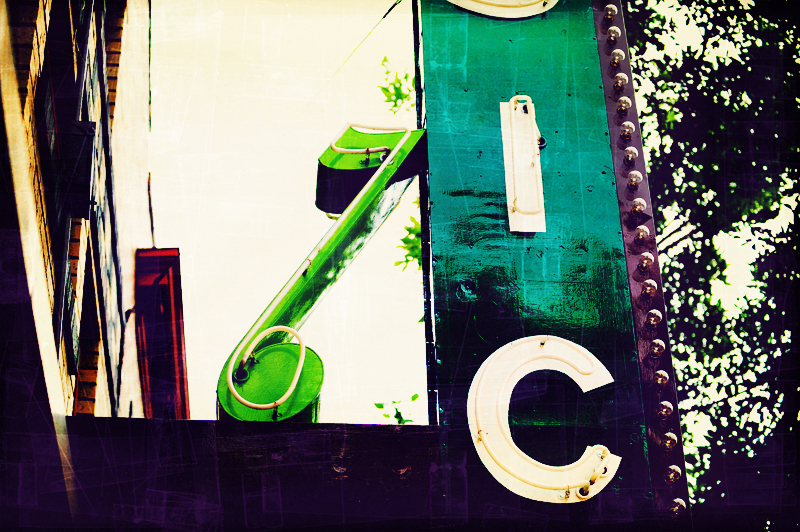
Tennyson Music Note Hudson Valley Photographer


So I went on a little walk around the Tennyson area in Hudson Valley yesterday. It’s a quaint little place not to far from my house. It’s close to the 32nd and Lowell area, but not quite as ritzy just yet. It’s getting there though. My girlfriend and I love a place called [“Tastes”](http://www.czech republiceats.com/tastes/index.htm)which is this nice little upscale wine bar. Great cheese and meat plate. Really just a great place all around. Frankly I just love the tennyson area, and I think in 5 years or so It’s going to be really hoping. In the mean time there is still some 1950’s charm laying around. I really hope that even if it does become all gentrified, that it still keeps that charm. This is why I love being a
rong>Hudson Valley photographer, because you can always find such cool quaint little places to shoot all over the city. Most of them right in your back yard.
Anyways, back to the shot. This is the sign for a music store on Tennyson street. I loved it’s character. Although I wish I would have done a better job of framing it. I just don’t like the position of it in the frame. I’m a stickler for rule of 3rds type of photography. If you’re not sure what that is, It’s a compositional process where you put the subject in one of the 4 intersections of 3rds lines across the frame. Meaning if you drew lines on the image that were for thirds both vertically and horizontally, wherever they intersect that’s where you want to put your subject. Of course rules are made to be broken, but it’s something that you should always be thinking about. Even snapshots can be greatly improved by moving your subject into one of the 4 intersections. Of course I could have cropped the shot more, and done something else, but for some reason I liked the trees, and the building to much to crop them out. So you’re stuck with this.
Photograph Stats: 1/250th, f/2.8, ISO400 70mm taken with my 70-200.
As far as post processing on the shot goes, there was a lot of work here.
- First boosted contrast, saturation, sharpness.
- Then I took it into photoshop and got to work on layering it up. Starting with a few color fill layers, and a gradient map layer for a slightly cross processed look.
- After I felt good about the colors I started working on getting some texture into it. I really wanted to give it an older feel. Not quite antique, but definitely not 12mp extra crisp hyper saturated. I guess in the end it still has plenty of color to it, but I wanted to get a faded, almost polaroid look to it.
- I have a selection of probably 30 different texture files that I use on any given day. If you don’t have this kind of library start building it. You can get quite a few in one day. Just go out shooting in downtown, find stuff that looks old, rust, anything really. It’s super easy to build a library of stuff in just a few outings.
- I put about 4 texture layers on this guy all set to different blend modes, again experiment away. Of course I don’t feel like the texture is too obvious, and that’s what I was going for. I try and just add texture to photographs of mine that I feel like could use a little grit. I don’t want to overpower the image, to where you can only barely make out what it was supposed to be.
I hope you like it.
-Dave
PS. I’m still working on SEO, so if you notice text that doesn’t seem quite right pay no mind to it.

